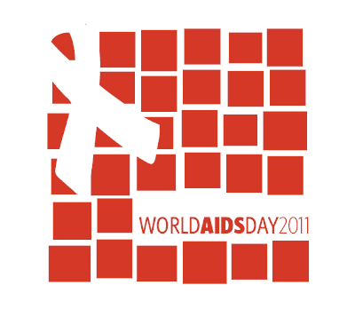
Throughout the weekend I have been doing more research on World AIDS Day and the AIDS pandemic itself to try to get a feel for the general mood behind the event and the participators who may celebrate or commemorate this day. It's harder than you'd think, trying to make a logo for an event that is so thematically serious and commanding of modesty without offending anyone, while also doing something that is not cliché and overdone so many times that it loses its effect.
I played around a lot with the idea of love, that no matter who you are or what disease you have, that you are "more than your disease"; that you have a story too. I wanted to use the idea of tolerance and acceptance; to use a symbol of understanding and compassion. This would bring into account the "education" part of World AIDS day.
I began playing with the idea that the inside loop of the AIDS ribbon was in the shape of a heart instead of just the negative space loop. The shape of the heart, although it is a rather overused shape, seemed the most fitting for my "love" and "tolerance" theme. I pictured a campaign of different people holding up a giant paper heart in different shades of red, perhaps with a name of someone, or a small story written out on it. This would showcase that everyone has a story.
I took that idea and thought about building the red ribbon entirely out of different shaped hearts, as if I had asked 50 people to draw a heart, and they all look different. I pictured grandiose marketing where these different hearts are painted on the sidewalk leading up to the steps of MODA on World AIDS day.
But even then, I couldn't get over the fact that hearts are overused and I didn't want it to look like an awareness day for heart problems, or a big Valentine's Day festival in December. I thought about MODA as a brand and decided to change the hearts into squares, tying back to MODA's identity, and making the shape more simple.
Once I got this idea into the computer and laid out my general composition, I began adding more squares to the shape and altering the different squares themselves, making some smaller and some larger, then breaking the grid of them to give them a jumpy, Saul Bass-inspired look. I keep picturing giant cut paper squares and how they wouldn't be perfect if they had been lined up by people. The variations also represent the individuals and their different stories, or their different names. I pictured each square almost as the AIDS quilt itself, harking back to the fact that this quilt will be present at the event.
I decided to add in the red ribbon as a negative space because I feel the shape is powerful enough with the red squares to showcase AIDS awareness without throwing it in someone's face. Also, after the red ribbon and the type treatment are placed, there are exactly 24 red squares in their entirety still remaining--this represents the 24-hour period of the MODA event.
I'm happy with how this turned out. I think there is enormous potential for a further marketing campaign with the concept and I look forward to seeing how things pan out.


