Sunday, November 27, 2011

Top 5 Strongest Portfolio Pieces (For Liz)

1. Botany Bay Florist logo & stationery
I think this piece shows my branding skills and being able to take an old logo that spoke nothing about the company and give them something fresh and relevant. The use of colors helps brighten the company's vibe and using a simple symbol like a circle to create a shape and a pattern helps open up infinite visuals for the company in the future.

2. HLN campaign & video
This section of my portfolio shows an ability to work as a team, conceptualize entire campaigns from start to finish, and divide work accordingly. My video showcases the use of Adobe After Effects and art directing to set a mood and peak interest in a product. The group involvement in the layout of the Spectrum|2011 application shows a use of hierarchy and ease of usability. As for the creative brief packaging, well, I only wish I could claim that design too :P

3. Poets&Writers Magazine redesign
This showcases my ability to carry out formatting through multiple pages of a product. In addition to paragraph formatting, this magazine shows my photography skills and type & color hierarchy within the magazine to ease in readability and show the most important information first.

4. Folie a Deux wine rebranding
Once I re-build it to my new design, this will showcase not only my brand identity skills with the logo, but also a concept behind a gift packaging and the ability to design on a three-dimensional plane.

5. Alice in Wonderland kinetic typography
This shows my ability to use different typefaces to create various personalities within the sound clip, as well as an ability to use Adobe After Effects.

"It Gets Better" video campaign thoughts

I figured out almost immediately what kind of mood and music I wanted playing throughout the video. I wanted something quiet, something that could relate to the mental depression that bullying creates; nothing loud or jarring to the ears but music that almost sounds sad in a way. Yet, with the lyrics, I wanted them to convey a sense of hope even through hard times. The song I chose is called "Crosses" by Jose Gonzalez. The music video is here:


Essentially the main section of the song that I am editing will showcase the chorus line, "We'll cast some light and you'll be alright." This is a main part of the visual that I plan to show in the video.

I also have a video clip of my nephews saying "sticks and stones may break my bones but words will never hurt me." I want to be able to use it in either the beginning or the end of the video but that depends on how the rest of the visuals pan out and if it still fits in.

Tuesday, November 8, 2011

MODA Design Competition concept


This competition, geared toward fundraising for MODA at the end of the year, holds the same square shape that they use in all of their icons.

The concept here is that the recipients of the MODA email have probably supported MODA in some way throughout the year to be on their mailing list (whether that is monetarily, becoming a member, or just visiting the museum and showing support by appearance). MODA is saying that without all of this support, they wouldn't exist. This is highlighted by the knockout MODA logo from the red, almost giving the logo a negative space. The only thing that brings the logo back to red is the ribbon on the third box, showing that the gift of support is what keeps MODA alive.

In the copy, MODA thanks everyone for the general support (whatever form that may take) and asks for a donation to keep the support going. By thanking individuals beforehand and acknowledging that patrons of the museum is what makes a museum, I think more people would be willing to donate and would actually be happy to.


Tuesday, October 18, 2011

DIP logo, business card, menu design, tshirt

DIP is an imaginary food truck that I created for my Corporate Identity class. It serves various types of gourmet dips and other dippables in a quick, easily accessible way for people who are looking for a different type of snack. The tagline is "I DIP. YOU DIP. WE DIP." This food truck is lighthearted and doesn't take itself too seriously, though the food is definitely serious with a gourmet twist on regular dips.

LOGO:

BUSINESS CARD:

MENU FRONT:

MENU BACK:

MENU CLOSEUP:

TSHIRT/UNIFORM DESIGN (IN PROGRESS):
FRONT/BACK
The type of dipper will change depending on what the employee would like. Options include Dapper, Dainty, Little, Big, Decadent, Diablo, and Debonair (taken directly from menu items.) Shown: Dapper


Tuesday, October 11, 2011

Final Logo Edit

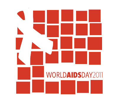
This is the final logo for MODA's World Aids Day event that Laura and Brenda chose out of the five edits I sent them. Their request was to have the type more readable and larger than the previous logo.

I'm happy with this one (although it wasn't my personal favorite from the bunch) but I think it still holds the original aesthetic that I was aiming for. I am still happy with it :)


Tuesday, October 4, 2011

Updated MODA AIDS logo

After getting some feedback about altering the individual squares further, here is my final logo I sent to MODA. The changes are minor but I can see how breaking up the grid a little more makes the squares feel more unique.


MODA's World AIDS Day logo

Throughout the weekend I have been doing more research on World AIDS Day and the AIDS pandemic itself to try to get a feel for the general mood behind the event and the participators who may celebrate or commemorate this day. It's harder than you'd think, trying to make a logo for an event that is so thematically serious and commanding of modesty without offending anyone, while also doing something that is not cliché and overdone so many times that it loses its effect.

I played around a lot with the idea of love, that no matter who you are or what disease you have, that you are "more than your disease"; that you have a story too. I wanted to use the idea of tolerance and acceptance; to use a symbol of understanding and compassion. This would bring into account the "education" part of World AIDS day.

I began playing with the idea that the inside loop of the AIDS ribbon was in the shape of a heart instead of just the negative space loop. The shape of the heart, although it is a rather overused shape, seemed the most fitting for my "love" and "tolerance" theme. I pictured a campaign of different people holding up a giant paper heart in different shades of red, perhaps with a name of someone, or a small story written out on it. This would showcase that everyone has a story.

I took that idea and thought about building the red ribbon entirely out of different shaped hearts, as if I had asked 50 people to draw a heart, and they all look different. I pictured grandiose marketing where these different hearts are painted on the sidewalk leading up to the steps of MODA on World AIDS day.

But even then, I couldn't get over the fact that hearts are overused and I didn't want it to look like an awareness day for heart problems, or a big Valentine's Day festival in December. I thought about MODA as a brand and decided to change the hearts into squares, tying back to MODA's identity, and making the shape more simple.

Once I got this idea into the computer and laid out my general composition, I began adding more squares to the shape and altering the different squares themselves, making some smaller and some larger, then breaking the grid of them to give them a jumpy, Saul Bass-inspired look. I keep picturing giant cut paper squares and how they wouldn't be perfect if they had been lined up by people. The variations also represent the individuals and their different stories, or their different names. I pictured each square almost as the AIDS quilt itself, harking back to the fact that this quilt will be present at the event.

I decided to add in the red ribbon as a negative space because I feel the shape is powerful enough with the red squares to showcase AIDS awareness without throwing it in someone's face. Also, after the red ribbon and the type treatment are placed, there are exactly 24 red squares in their entirety still remaining--this represents the 24-hour period of the MODA event.

I'm happy with how this turned out. I think there is enormous potential for a further marketing campaign with the concept and I look forward to seeing how things pan out.


Thursday, September 22, 2011

Campaign logo, banner visuals

These are quick renditions of visuals for our HLN initiative, which will be reworked after thorough studying of the HLN style guide in the next 2 weeks.


HLN Creative Brief

Client: HLN: WHERE PEOPLE TALK.™

Overview:
SPECTRUM | 2011: The Year in Colors
We will create an interactive, online tool that organizes news stories of 2011 based on both their physical colors and the emotions evoked by certain colors (as outlined by psychological institutions). Users will be able to select a color from a spectrum and browse stories associated with their choice. (ie: Stories about health are green/blue).

Content:
MUST-SEE
We are presenting a unique way for people to revisit stories of the year based primarily on their colors. By allowing people to discover stories based on a single color choice, users will enjoy browsing news headlines more, while simultaneously finding more unique stories of interest they would not have found otherwise. Since color is one of the first things a person recognizes when seeing something, this allows people to remember things more vividly. To add an extra dimension, the stories within each color category will be arranged by popularity, with varying levels of color vibrancy based on interest on the subject.

When selecting the way the viewer would like to search by color (physical color or psychological color), a link will appear for readers to see how HLN organizes the stories. (ie- “How does HLN determine what stories are psychological ‘blue’ stories?”) The answer will contain links to reputable organizations showing data and research on certain colors and the evoked emotions.

To direct viewers to the campaign on HLNtv.com, we will also incorporate web banner ads asking people, “What is the color of your news?” using a spot color visual with the HLN icon and directing them to the Spectrum | 2011 section of the HLNtv.com website.

This web initiative is made stronger by the alignment of the week-long program that HLN will adopt on-air, focusing on a different color of news each night of the week.

MUST-SHARE
Social networking will be integrated into this application, allowing users to “share their color” with their friends and followers. We will also create Twitter “hashtags” to help spread their discoveries; eg. “My news is orange! #HLNspectrum.” There wil also be opportunities to link readers’ facebook accounts to the site so they can easily share interesting stories, and tweets may appear on-air during the week-long special featured on HLN.

Connecting their Twitter or Facebook account will allow users to add their current profile picture to the “HLN Spectrum Mosaic” — a large HLN icon comprised of all the photos people add. The HLN icon will retain its characteristic shape, but will now be made up of a spectrum, which will be derived from the photos added. Based on the color the reader selected before, their photo will be overlayed with a slight tint of that color and put into the corresponding area of the Mosaic. Colors can be shared on HLNtv.com using their already-established blog format.

MUST-WATCH
This campaign will also be a week-long program near the end of the year, where each night focuses on a different color of news. For example, all stories that fall under the “red” category might be discussed by anchors on Monday, and the color blue for Tuesday, etc. Anchors will devote a certain amount of time to the color of the day as it relates to their individual show.

TV advertising will show a black and white world that slowly gets taken over by spot colors, where people will see one to three selected objects in color. The viewer gets asked, “What‘s the color of your news?” This will spark their interest, resulting in their visitation to the program or website.

MUST-BUY
The intended sponsors would be companies such as Crayola, Epson, Sony, Kodak, HP, Toshiba, Samsung, or any company where color is the primary focus of their business. “Liking”, “following,” or “tweeting” about the Spectrum | 2011 campaign may result in daily giveaways (chosen at random) from the selected sponsors, such as gift cards, shopping sprees, or free cameras and TVs.

Target Audience:
People interested in looking back at 2011 in a new way; based on the color of the stories they found interesting. This can be any range of ages, though the current majority of HLN viewers tend to be women interested in popular culture.

Tuesday, September 20, 2011

What an amazing ad.

This ad was on the side of my Pandora radio player tonight, advertising the new Ryan Gosling/George Clooney movie, The Ides of March. Not sure what the movie is really about, but this ad is absolutely seamless in its design and storytelling:


Sunday, September 4, 2011

9/11 poster in progress

A customer of mine at the pub introduced me to a poem written in 1914 during the first world war and is mostly known to the people of England, but has come to represent any fallen soldiers or casualties of any war. Though 9/11 was technically before the War on Terror, I felt the poem spoke just as strongly, and the last line in particular is the most well known part of the entire poem.

I am choosing to use the last stanza of this poem on my poster, in addition to a pastel drawing of the twin towers at sunrise and sunset (as the poem states).

The poem is as follows:

They went with songs to the battle, they were young.
Straight of limb, true of eyes, steady and aglow.
They were staunch to the end against odds uncounted,
They fell with their faces to the foe.
They shall grow not old, as we that are left grow old:
Age shall not weary them, nor the years condemn.
At the going down of the sun and in the morning,
We will remember them.

-Laurence Binyon, "Ode of Remembrance" 1914


Tuesday, August 30, 2011

Bed Bug Awareness poster

A screen shot of my Bed Bug Awareness poster. I wanted it to be reminiscent of the kid's rhyme "good night / sleep tight / don't let the bed bugs bite" while bringing in the idea that when you are a kid, monsters go away when you hide from them. Unfortunately, bed bugs are immune to this idea.

The copy at the bottom reads:
"Bed bugs are no bedtime story. In fact, bed bug infestation has become a growing concern in the United States. But there is plenty we can do to avoid further damage to our homes. Discover our prevention tips, travel safety, and even more bed bug facts at www.cdc.org."


Sunday, August 28, 2011

Art of the Menu

I stumbled upon this website earlier. Awesome site highlight unique and fun menu designs from around the country.


The website is a section of a larger site called Under Consideration, which is also a neat database of design. Find that site here.

Public Service Announcement ad

This is my poster ad focusing on Food Safety Awareness for the Ad Council.

12"x18"

copy reads:
"It’s not always this easy to tell when your fruits and vegetables are dirty. To avoid the risk of spreading foodborne illnesses such as Salmonella, E.Coli and Listeria, be sure to wash fruits and vegetables before cooking or serving."


Thursday, August 25, 2011

Branding your Food Truck

From Urban Eats. Find the full article here.

"Food trucks, like any other small business, will require substantial capital, a well conceived brand and a clear value proposition. Consider these questions:
  • What makes my food truck different?
  • Why are certain food trucks more popular?
  • What is the lure of a food truck?
  • Is there difference between a food truck and a carnival trailer?
  • How do I get invited to the best food truck events?
  • Where do I source my food and beverage?
  • How many items do I have to sell daily to make money?
  • How do I price my menu?
  • I have no hospitality experience, can I operate a food truck?
  • What are the current rules and regulations that could affect my operation?"


Self-Promotion Ads

To promote myself back to my internship designers, I chose to use a few design skills I am more confident in: that is, the use of typography and writing copy.

I chose to make my two ads a series, where one is my testimony of the internship and the other is the testimony of any of the designers I may have been working with or under. I chose not to make the testimonies be some sanctimonious tales of how amazing I was as a designer, blah blah, but chose to take a more personable route. I chose to highlight myself in a way that showed not only how well we all worked together as a group of designers, but playing up even more that we all got along so well as people and as friends, which just made us all that much more productive. I ended the piece with something that had become a running joke within the office: my newfound love of baking cupcakes, which I would bestow upon my officemates occasionally.

I think that if I were a creative director and I was in charge of employing one of two people, where one was great at design but did not relate well to the other designers, whereas the other might not have had as wide a range of skill (or maybe he/she does) but got along great with the staff, I would choose the latter. Interpersonal relationships seem to make a world of difference in a creative field, and I chose to highlight the relationships I had with my fellow designers.